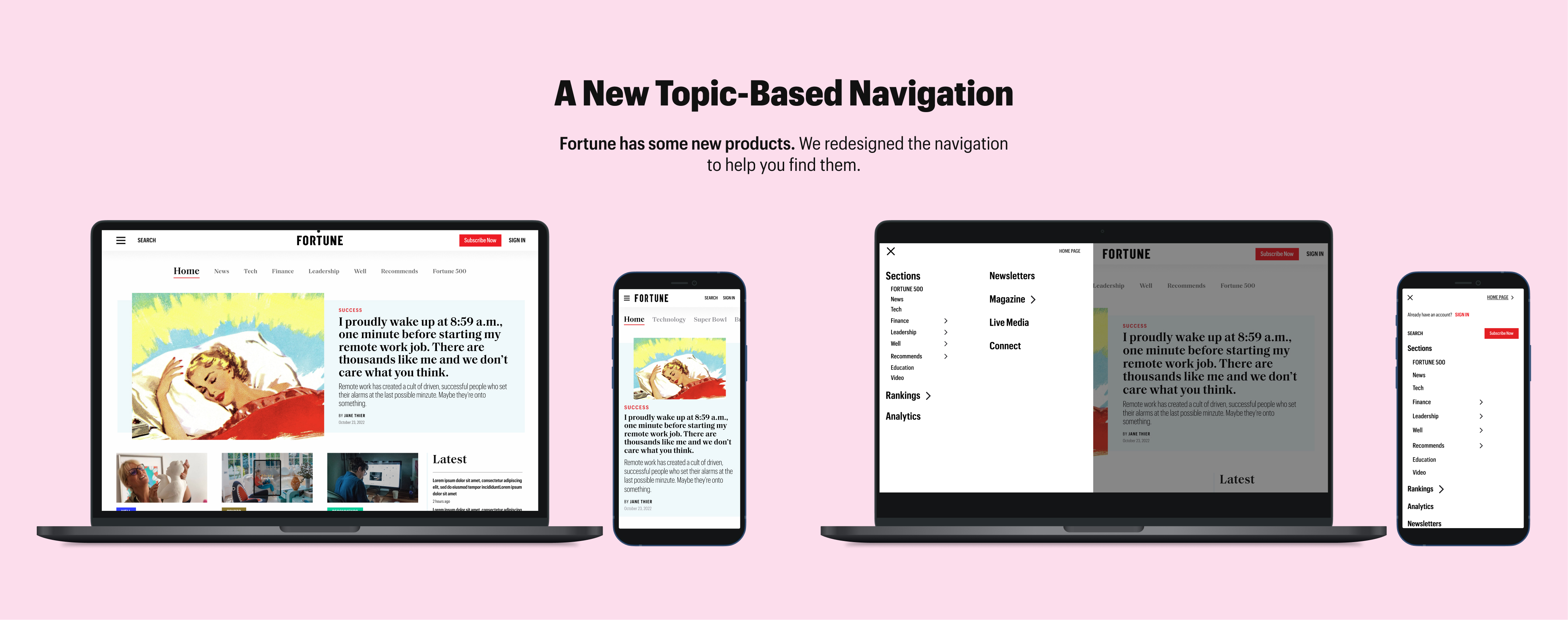



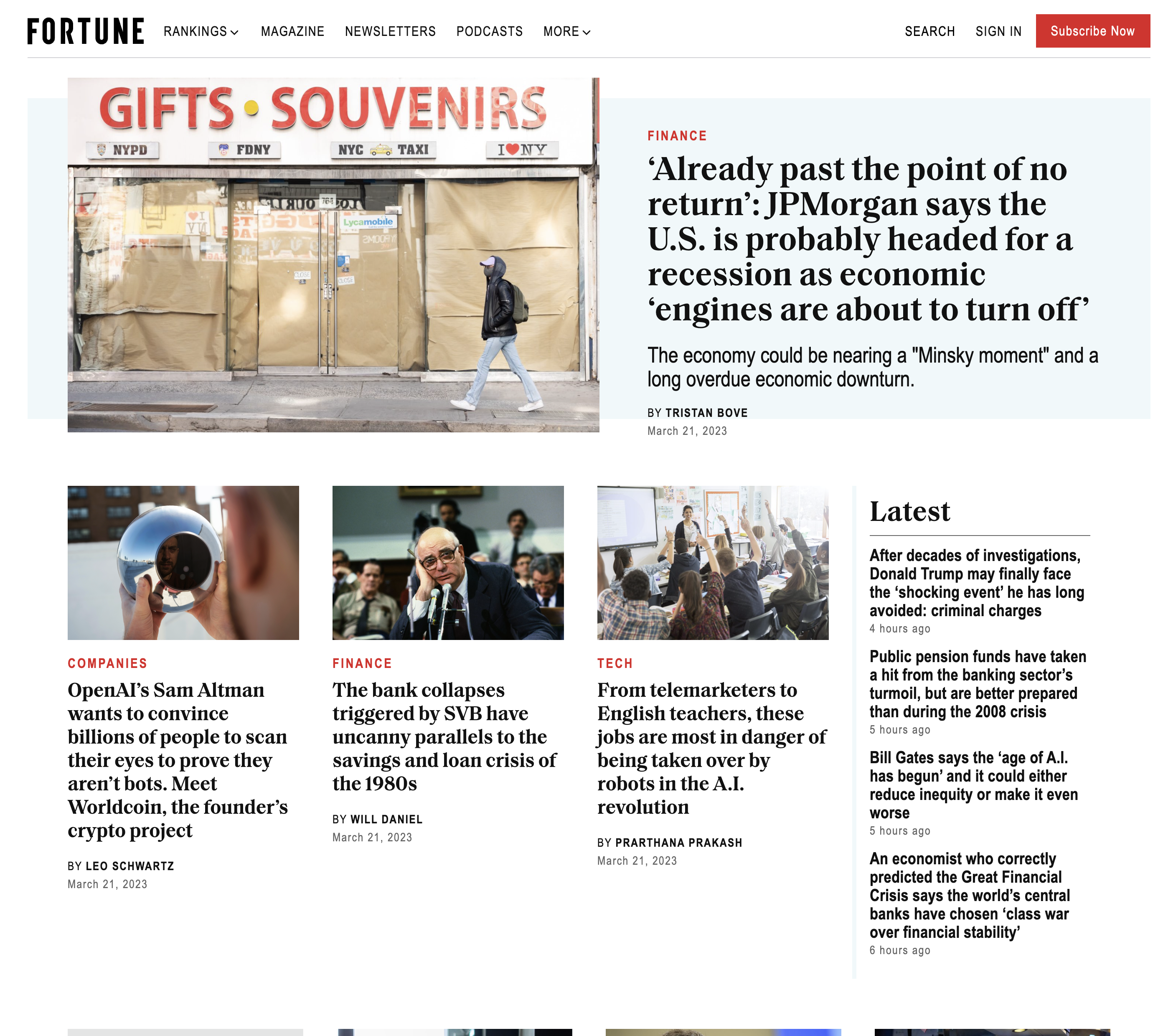
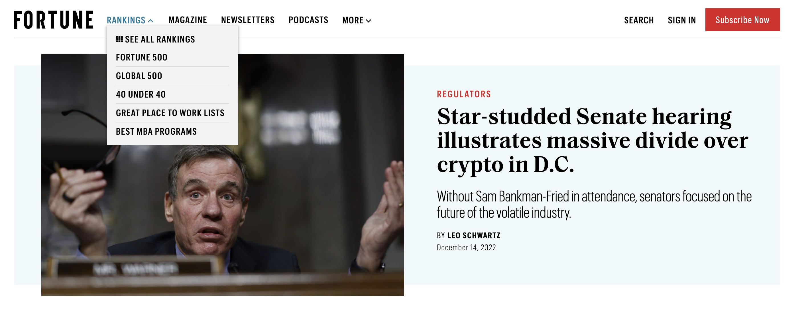
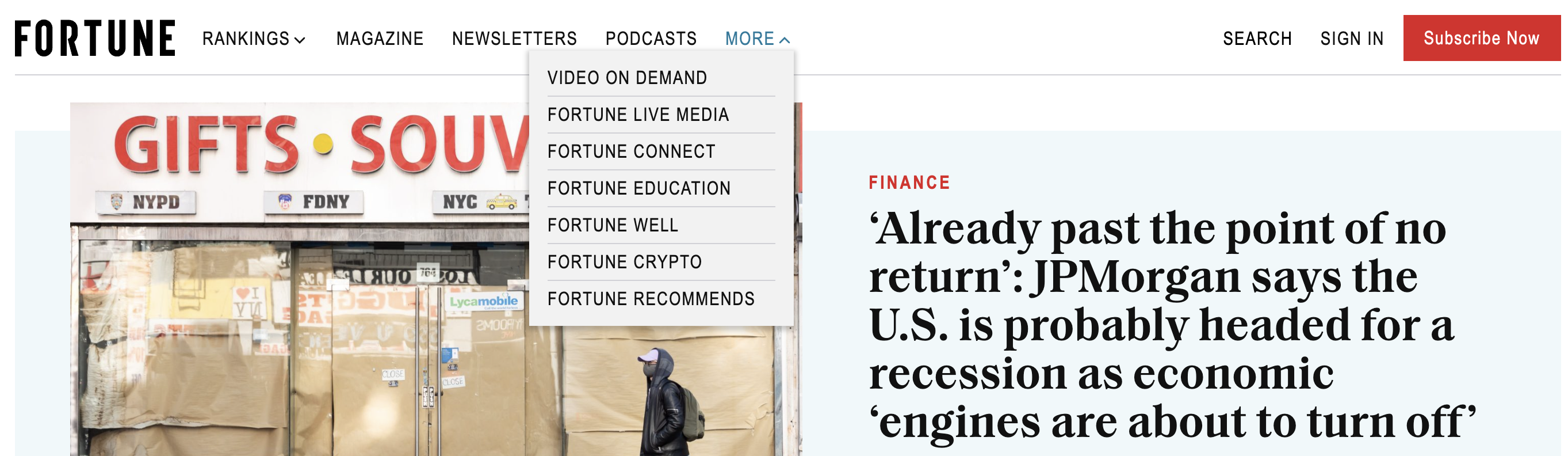
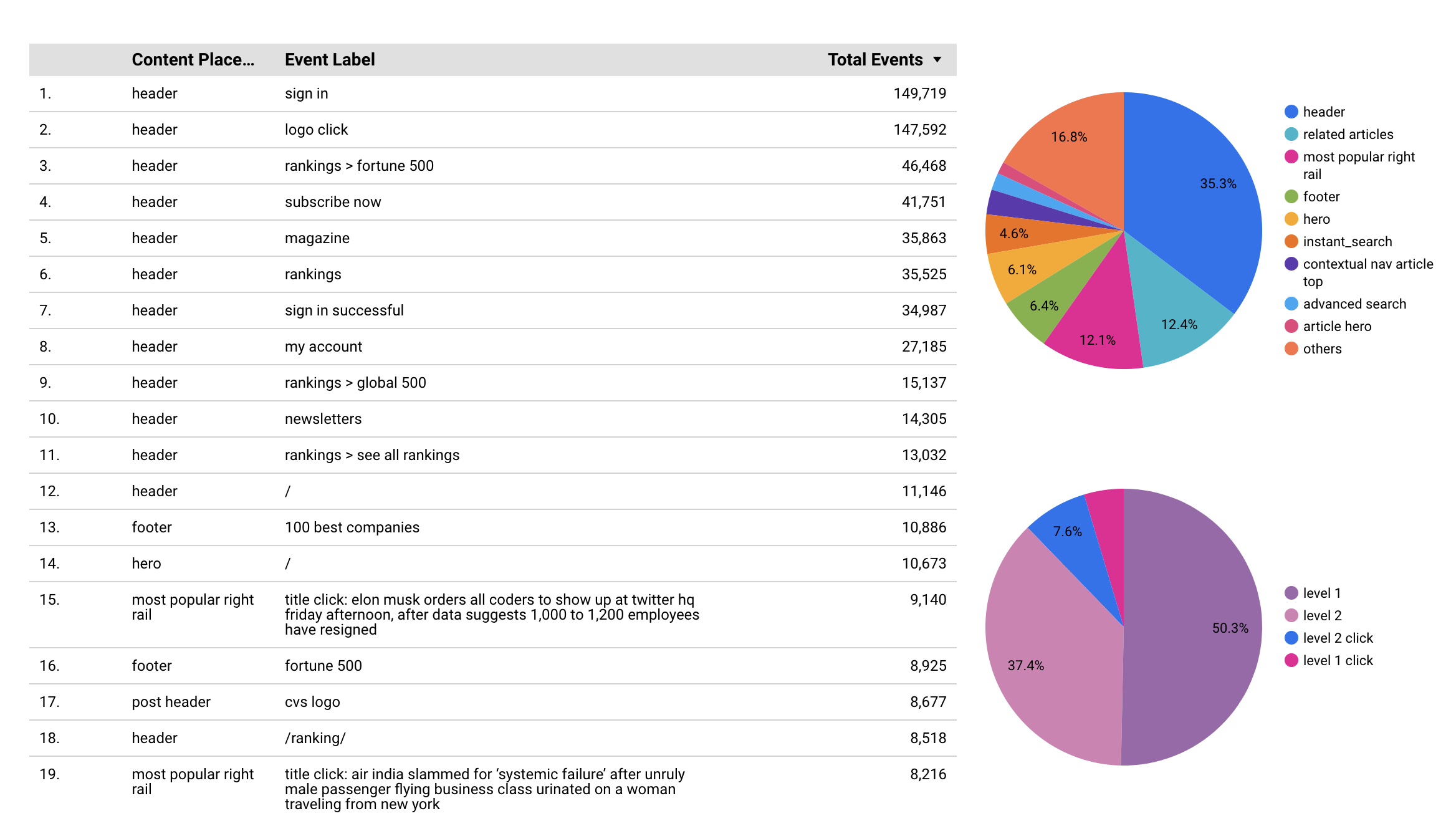
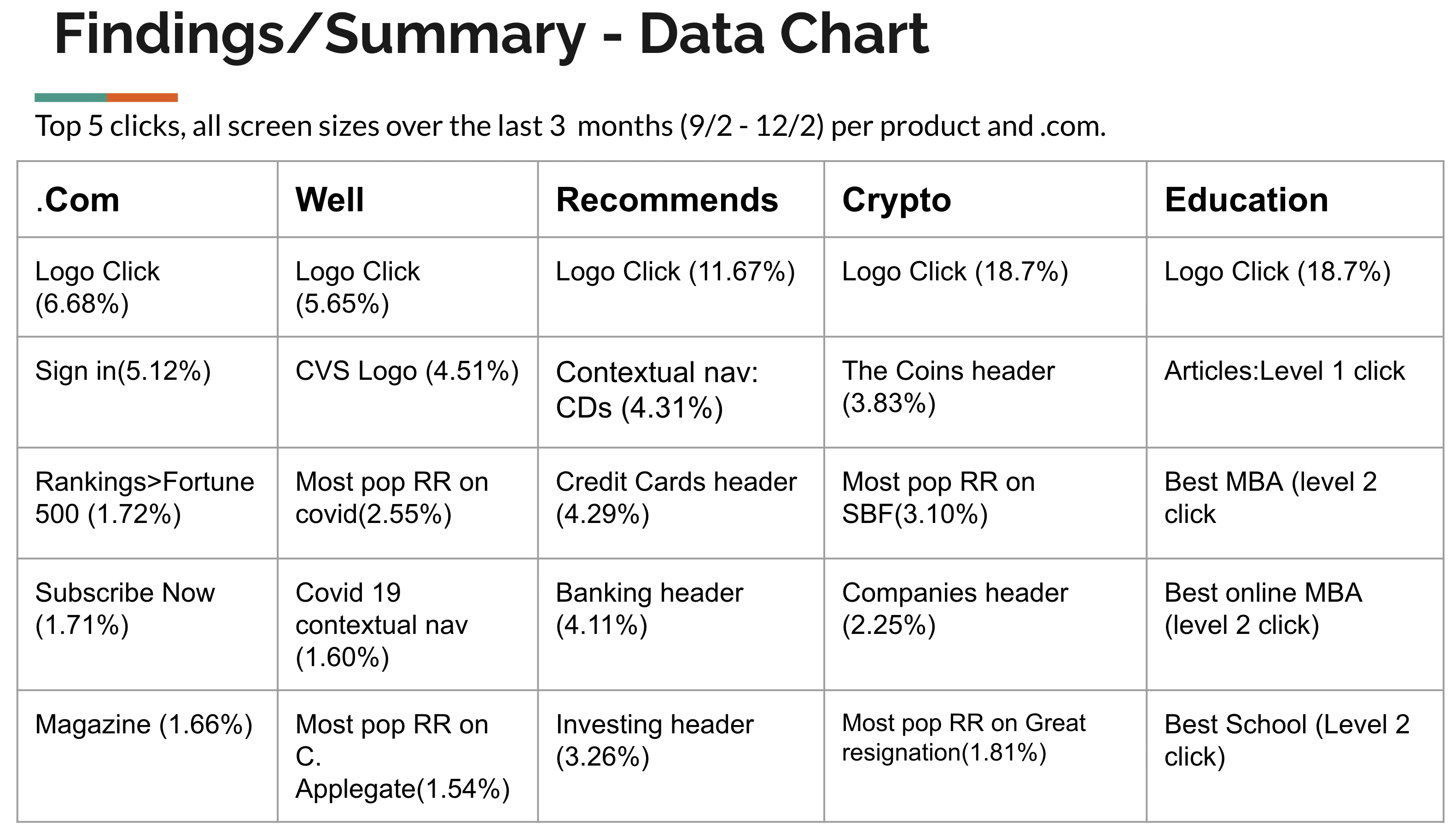
Fortune recently introduced new products and micro-sites. The old navigation didn't effectively showcase these additions, making it hard to explore the full range of content. We embarked on a ground-up redesign of the global navigation, incorporating user clickthrough data and UX best practices. Our goal was to highlight new topics and products, all while preserving Fortune's branding.

UX/UI Design Team, Engineering Team, Editorial Team

UX Designer

Entire process: 4 months. January 2023 to April 15th 2023.
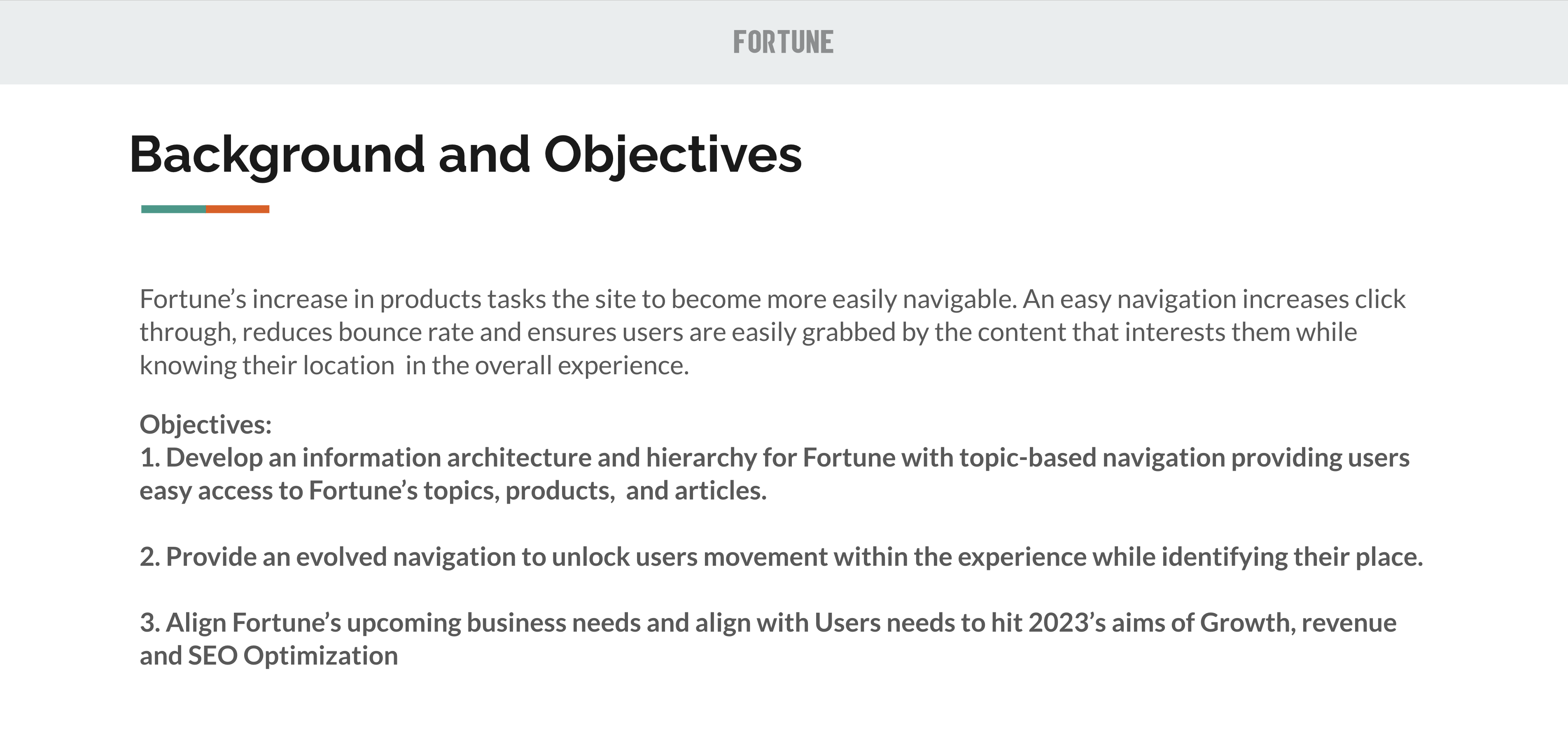




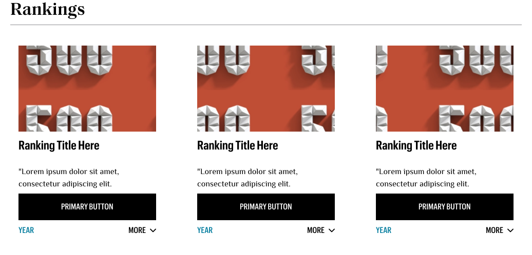
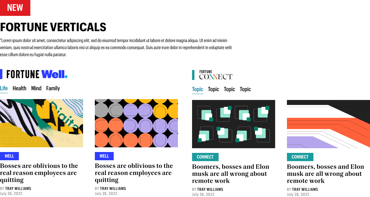
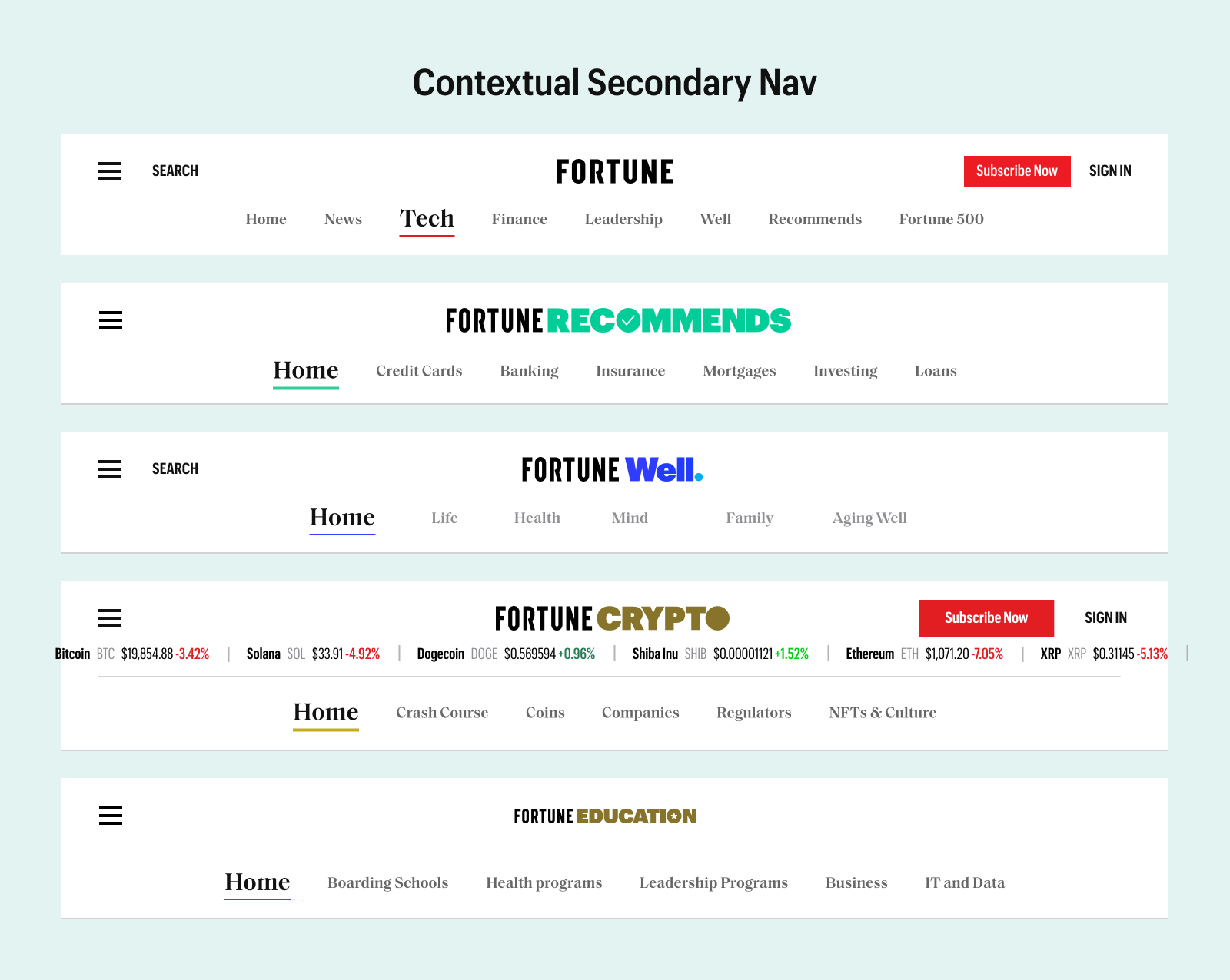
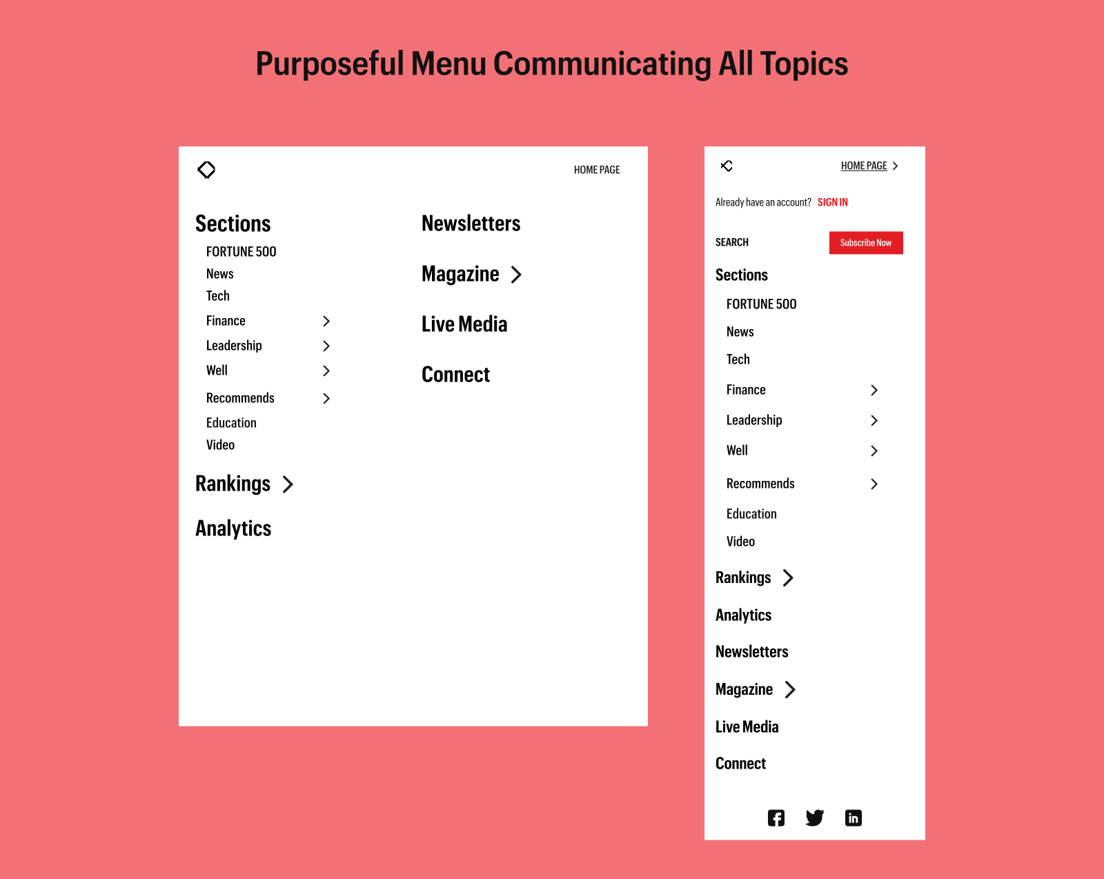
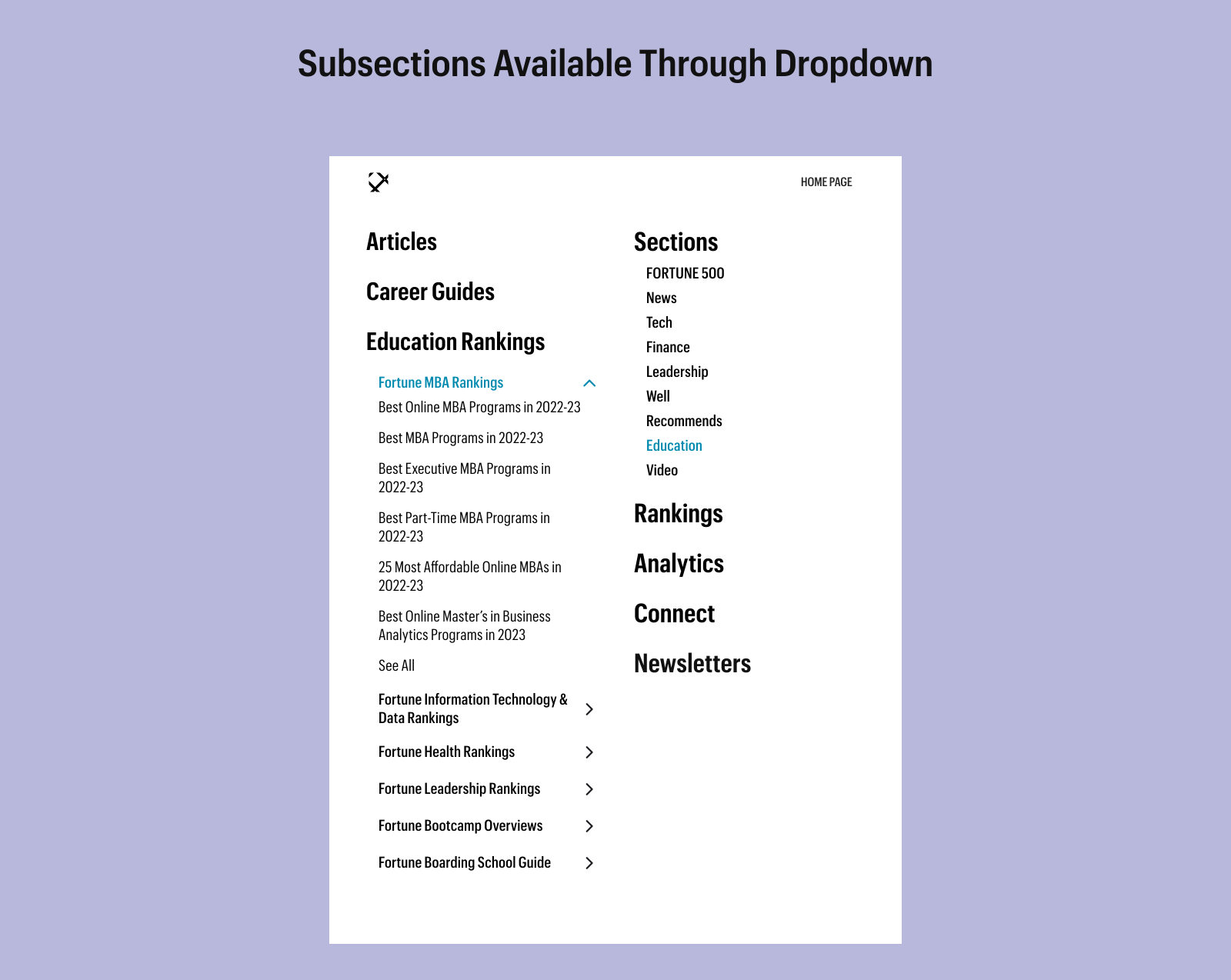
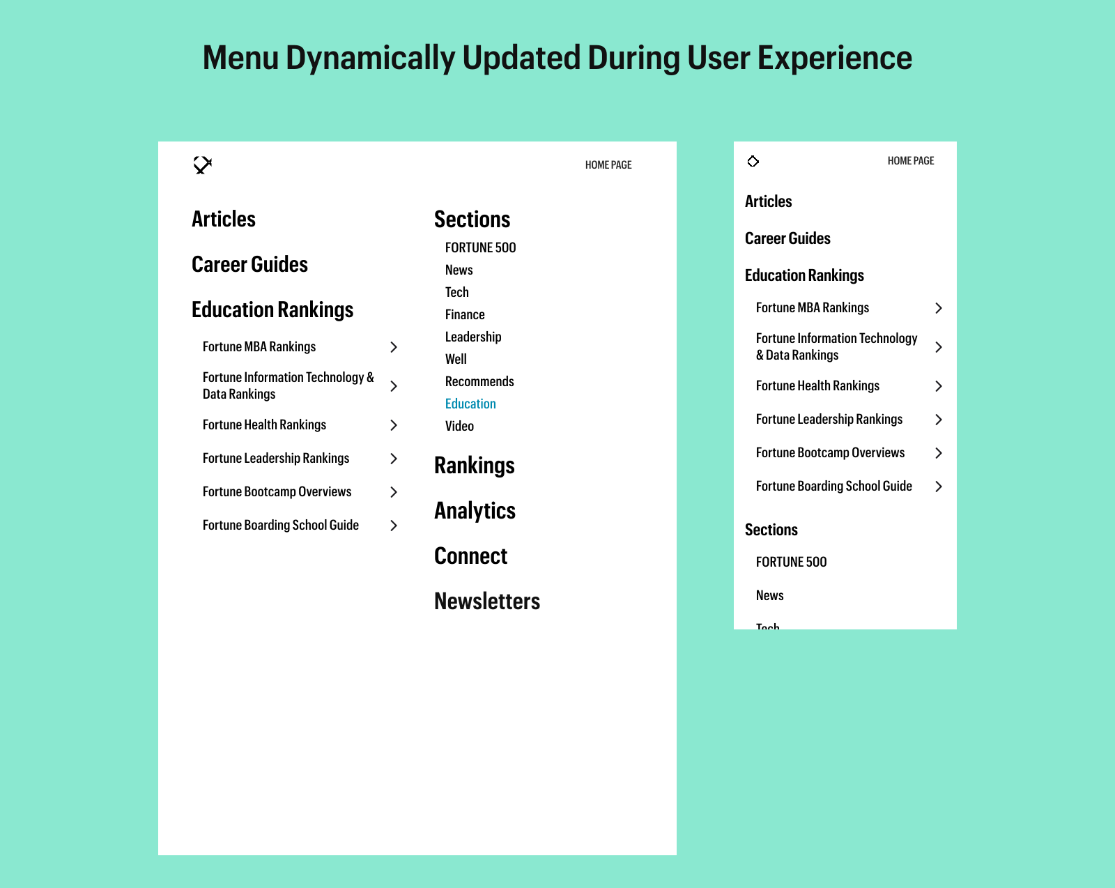
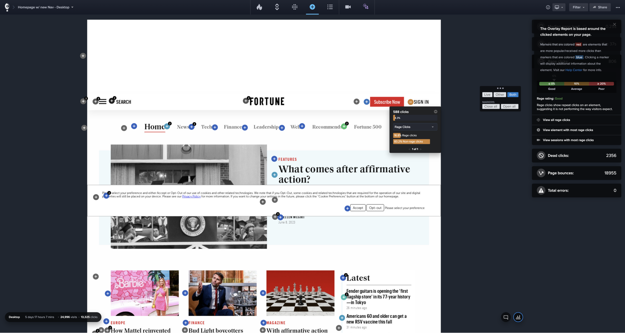
We knew from that start that designing a versatile business-oriented navigation that would satisfy a diverse set of teams would be tricky.
Also facilitating seamless navigation across both new and legacy products while creating future adaptability to the company's evolving structure were notable challenges.
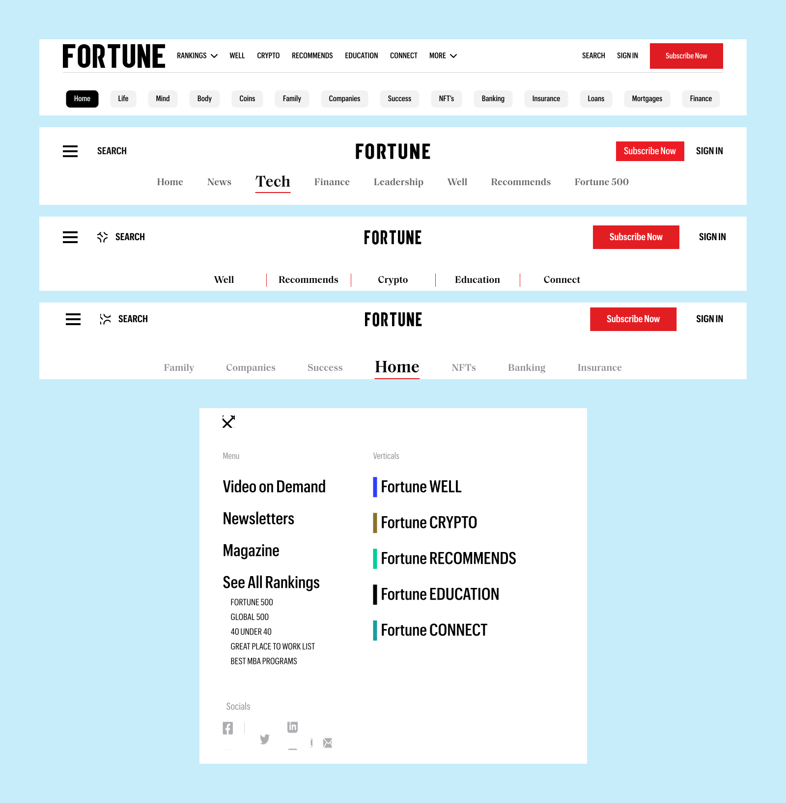
Our Design had to change quite radically because the company's strategic goals evolved in the middle of the project. Access to some products was deemphasized as different products took precedence.
Some proposed methods, like product color coordination through card sorting were removed due to branding disagreements as well.
We were able to design a successful navigation that is currently in production and going through additional user testing/heatmapping analysis. We’re comfortable that this fits all of the requirements of various stakeholders throughout Fortune. Test drive the navigation today.
Visit Fortune
Changing something so incredibly prevalent across a company requires a lot of sign off. And in thinking of this further we need to provide a better method towards letting stakeholders see more of the discovery process. At times it felt like a game of telephone where there became so much to communicate of the thought process that when it came from one mouth to the next to the next core elements were missing
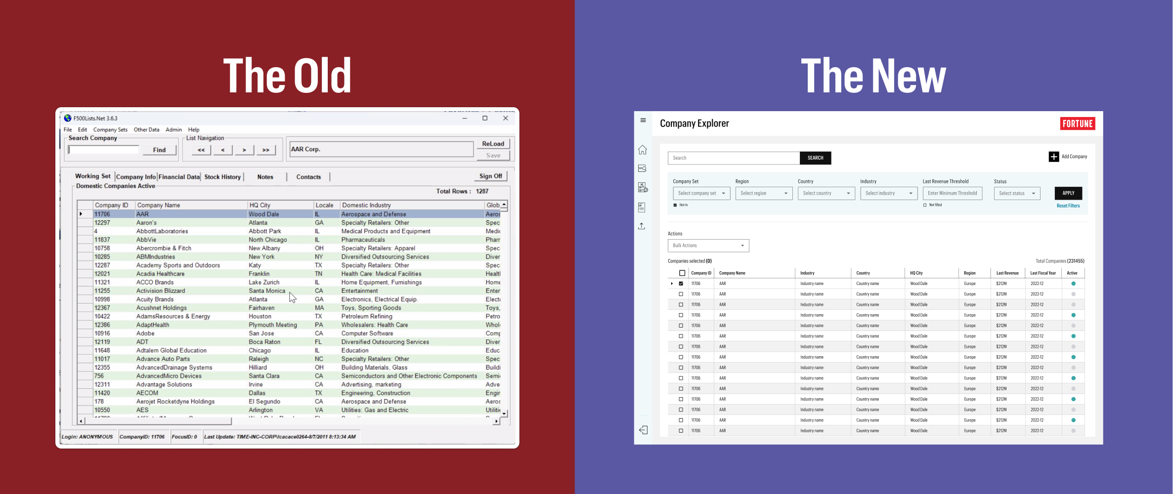
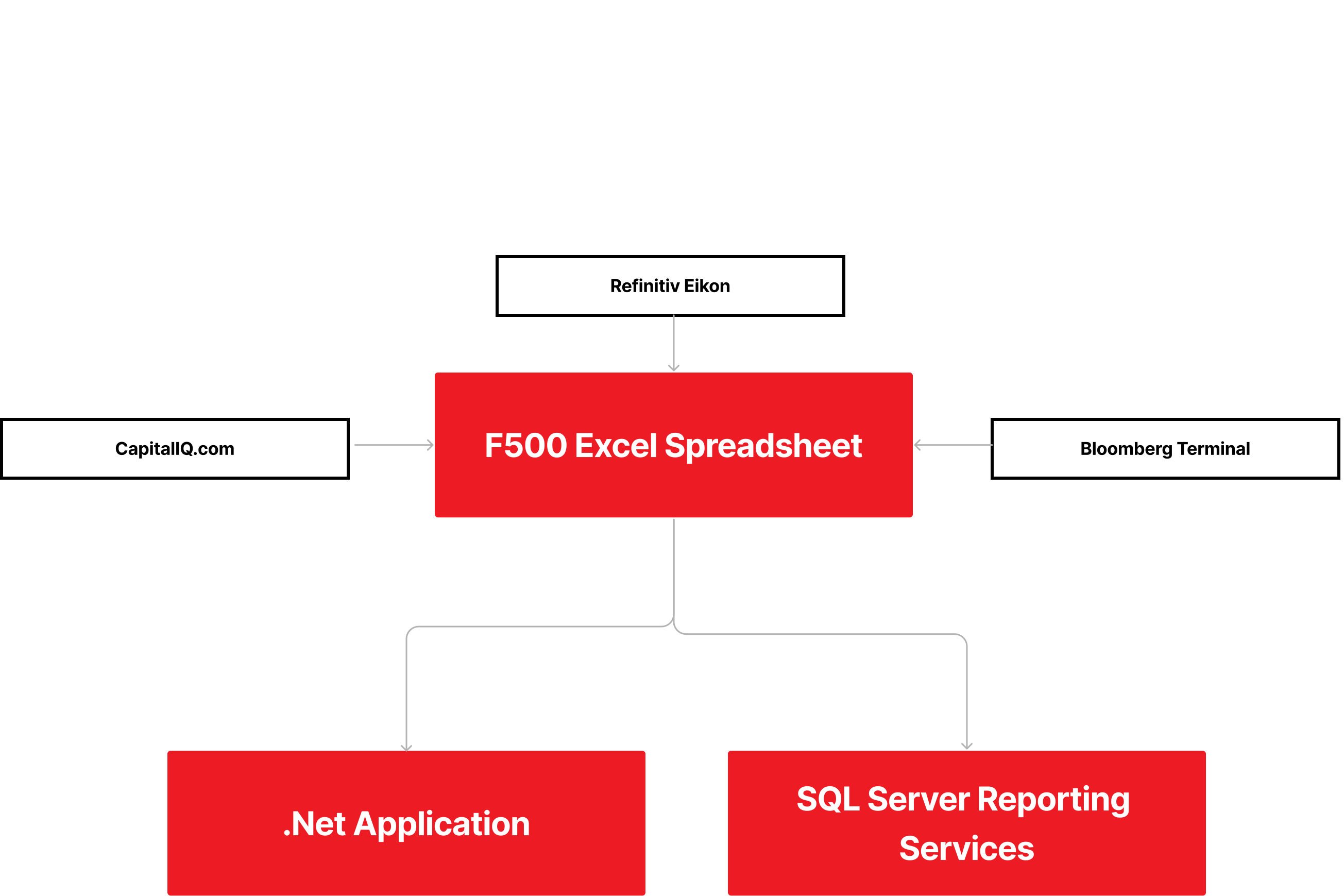
The F500 application process was outdated, relying on a 20+ year-old .Net app installed locally on user computers. Financial Analysts used multiple applications and stored data in several products like MS SQL Server, Excel, and the .Net app. Additionally, database queries and new reports needed to be requested and manually run by the database team each time.
1) Interviews with Senior Financial Analyst and database team to understand current process.
2) Defined core functionalities and established parity criteria.
3) Prioritized app sections by importance; designed most crucial screens first.
4) Designed section mockups, then created and demoed prototypes with Senior Financial Analyst to ensure they met his needs.
5) After approval, 3pillar developed screens on a rolling basis and placed them in the QA environment for further testing.
6) Created user test plans for conducting primary user testing in the live web app.
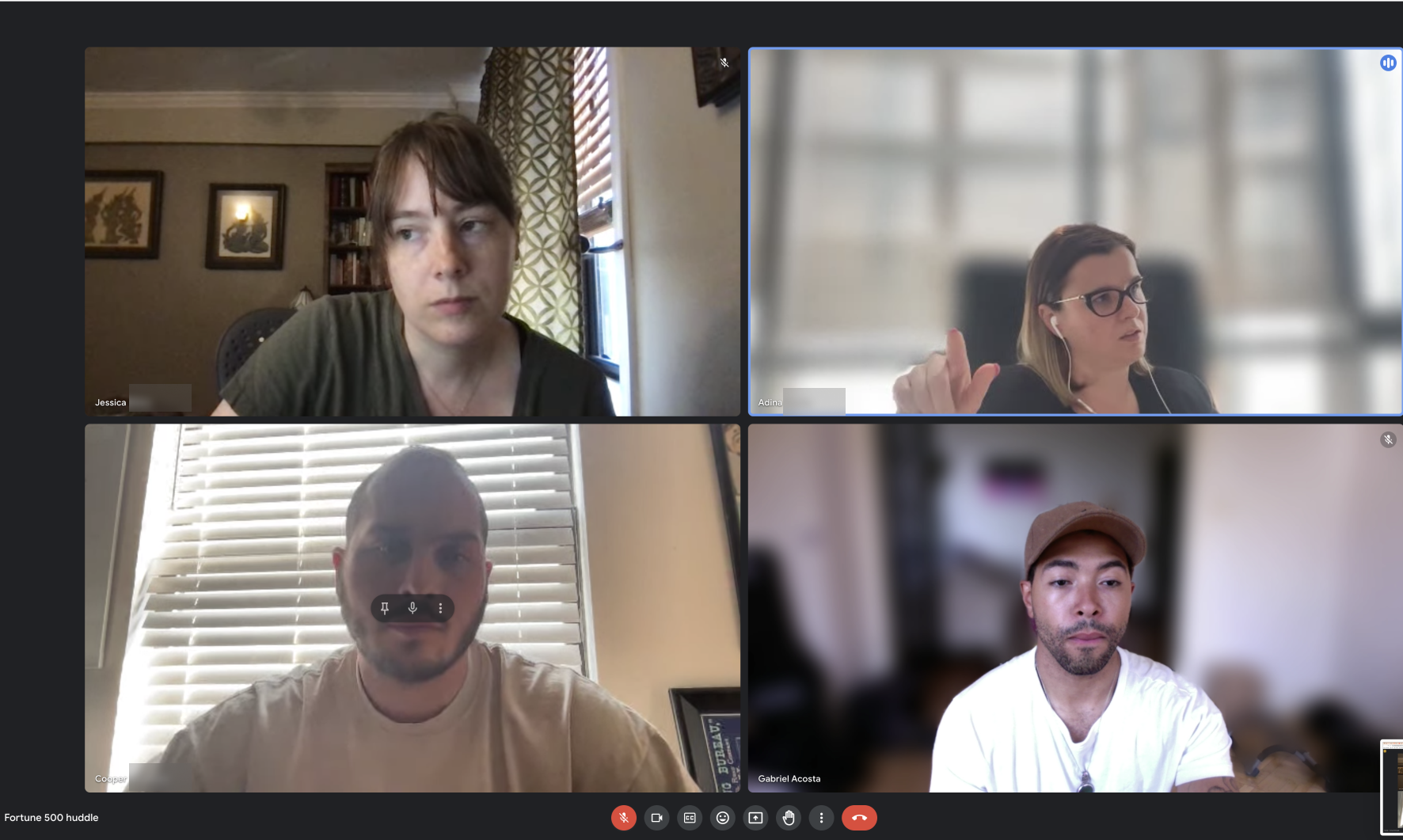
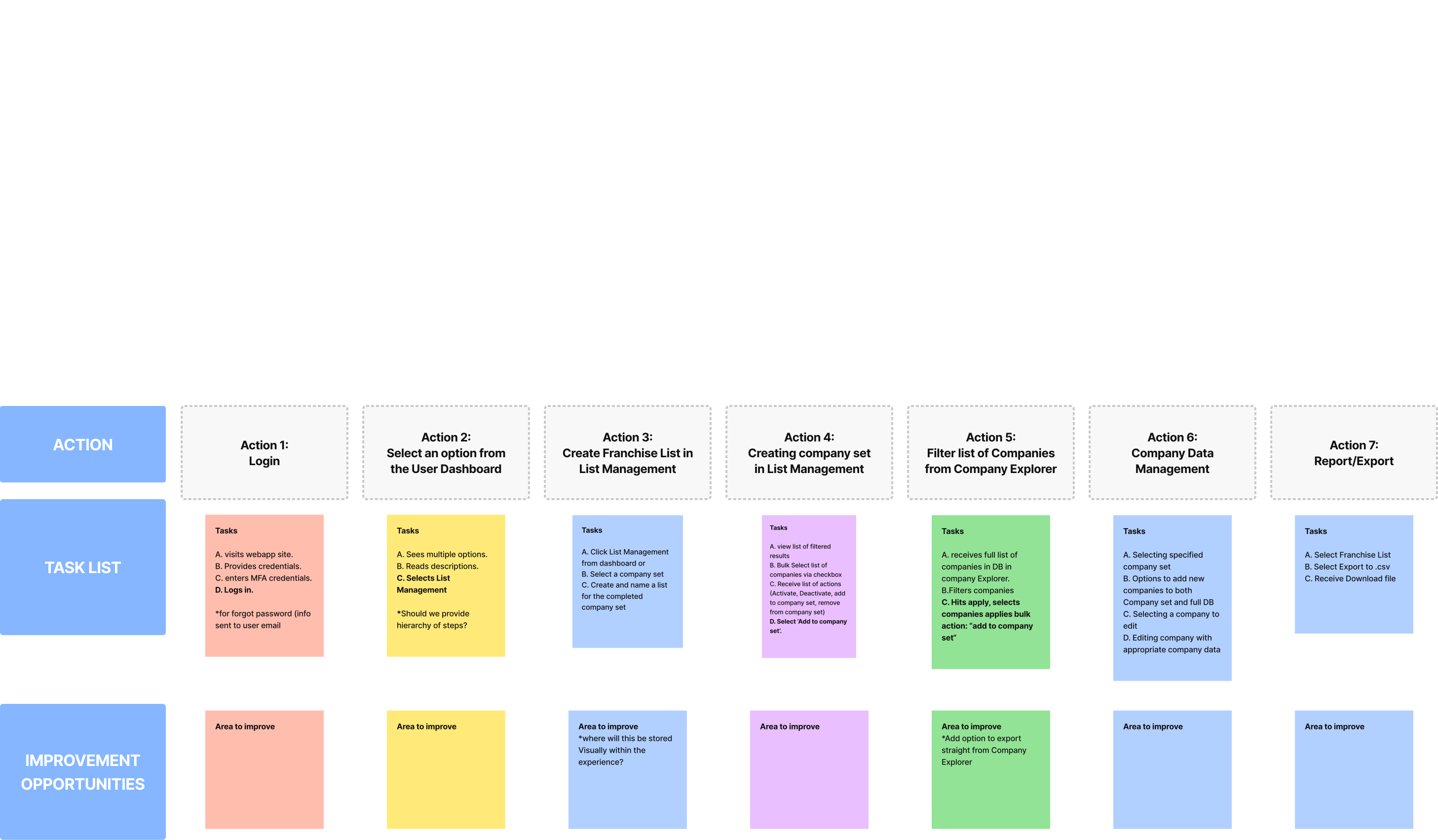
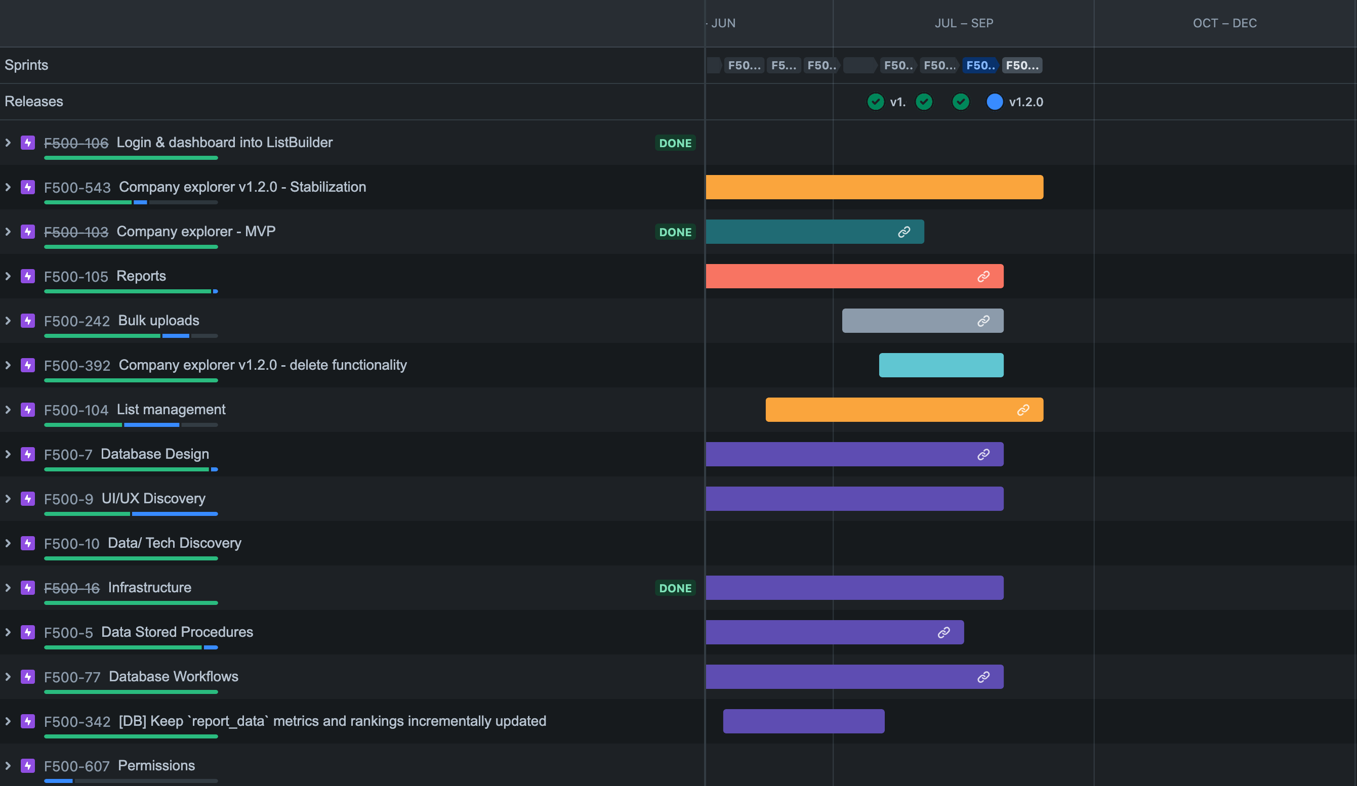
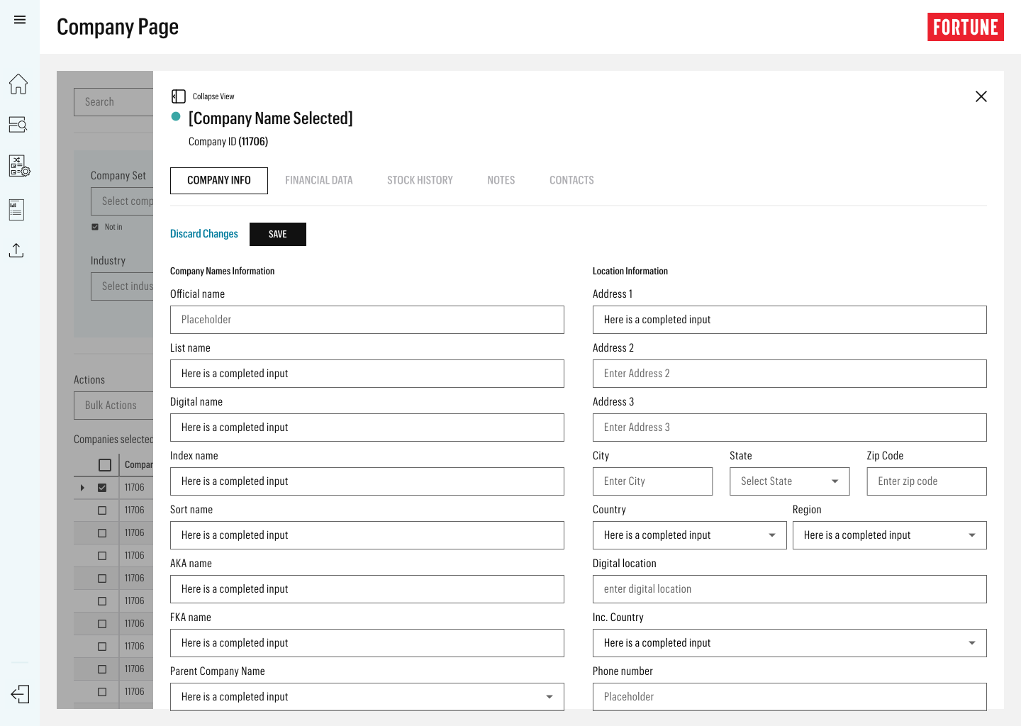
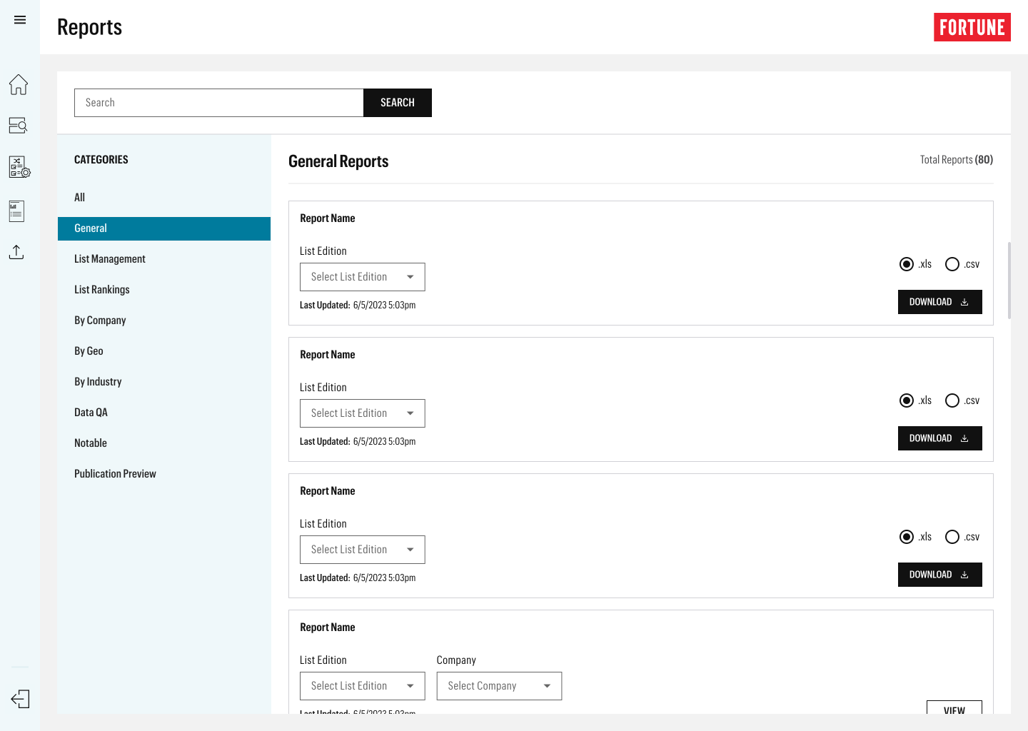
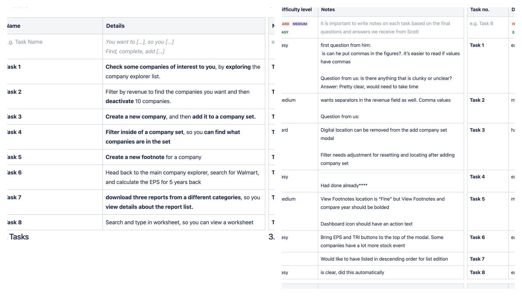
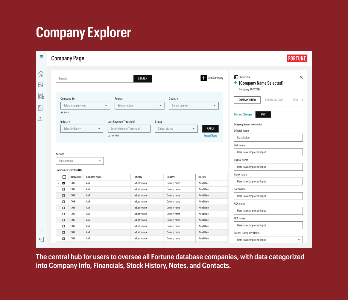
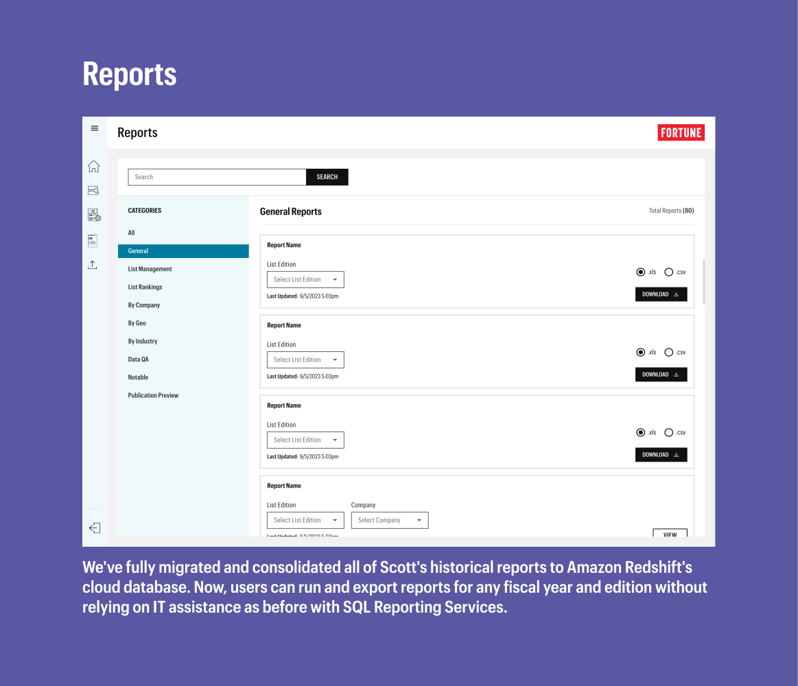
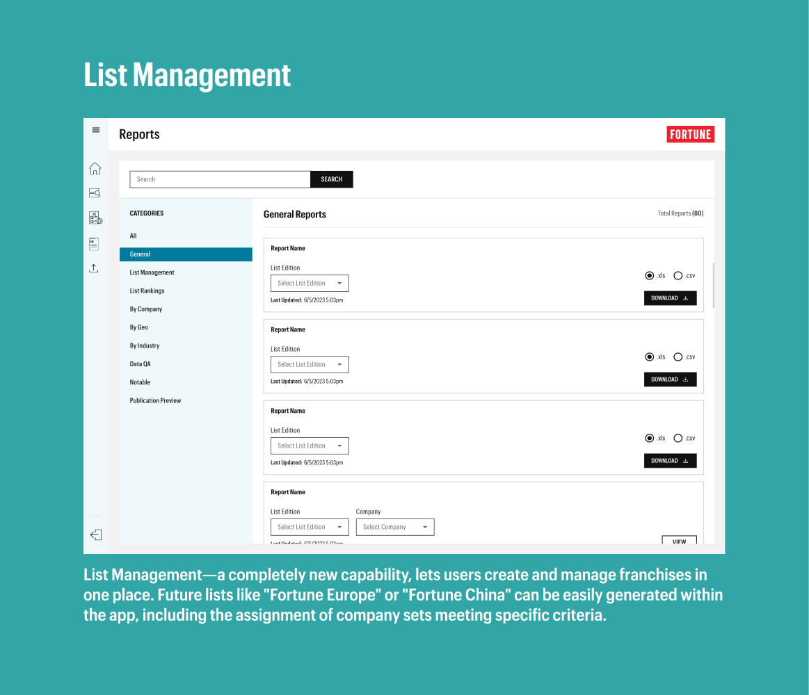
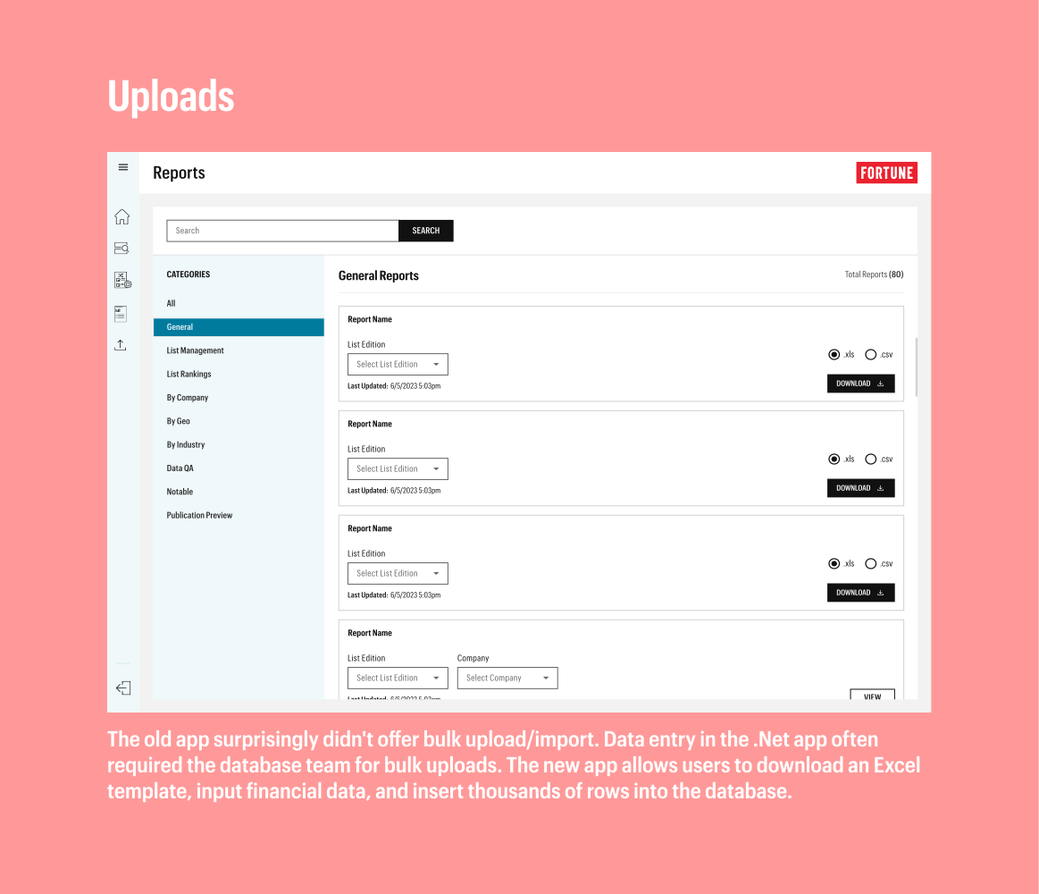
Developing an understanding of the full scope of the current process and all of the different functionalities performed by our main user. Accommodating all of these functions. Finding the balance between being able to maintain parity while also improving the current process.
We faced a time crunch with 3pillar's contract ending in September. Capturing every detail of Scott's process in the app was challenging due to the numerous, nuanced, and specific items he tracked. It felt like unraveling a Russian doll of complexity; the more we delved, the more layers we discovered.
We were able to design and build out the webapp. The launch was broken up into two phases. Company Explorer being the biggest with Reports page, then a phase two of list management and uploads as a fast follow.

Next, we'll gradually transition our primary user to the new app, having him perform individual phases of his Fortune 500 process. Moving forward, I aim to improve the communication and transfer of requirements from the database team. There were delays in understanding, and a more streamlined approach for distributing information from the database to the design team would have made this project even better.
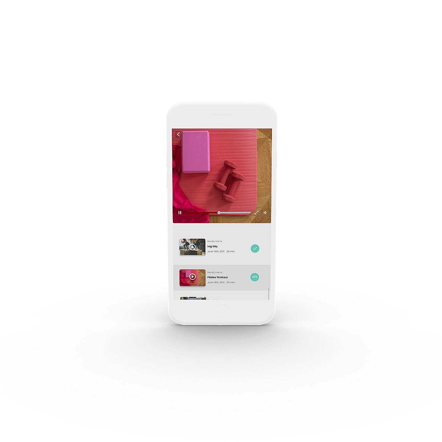
I aim to provide an affordable and personalized guided meditation and fitness app which can be used on the fly and integrate into peoples busy lives. A modern oasis in the palm of your hand.
“My Research was conducted primarily through surveys, interviews, and usability studies after the initial design had been created. I wanted to understand what people truly wanted out of meditation and fitness apps. Why they would choose this one over another? What instances were people most likely to use this app?”
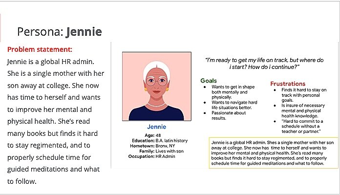
Jennie is a persona created from my research to represent the kind of user I aim to take care of with this app best!
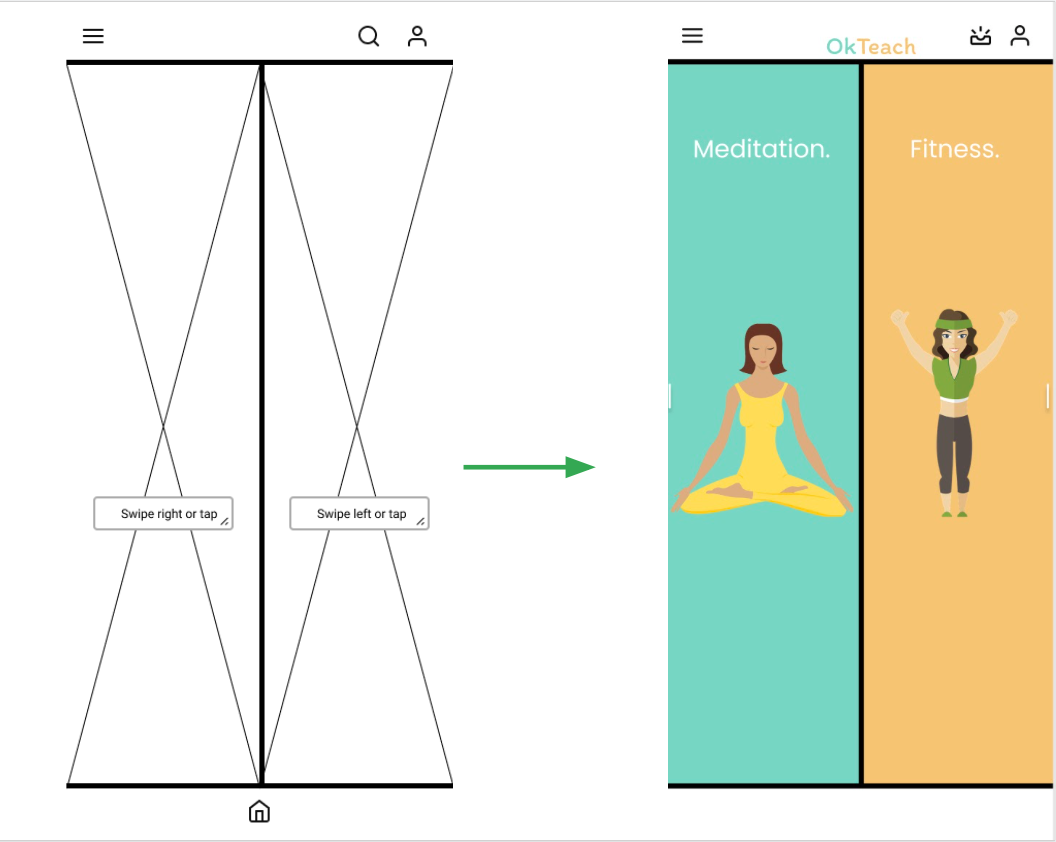
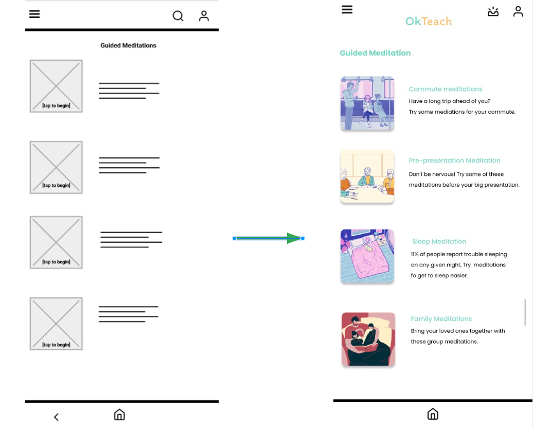
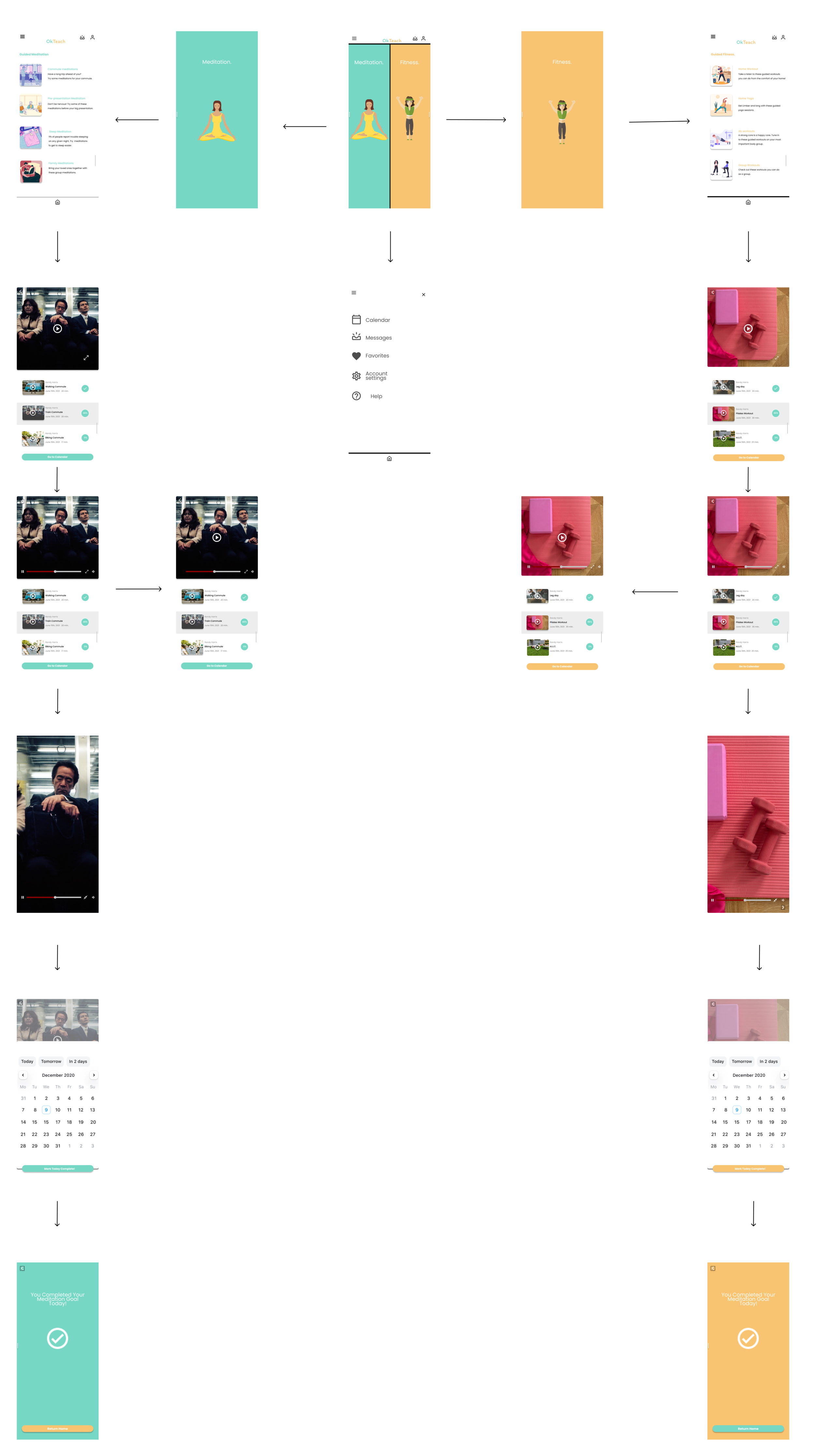
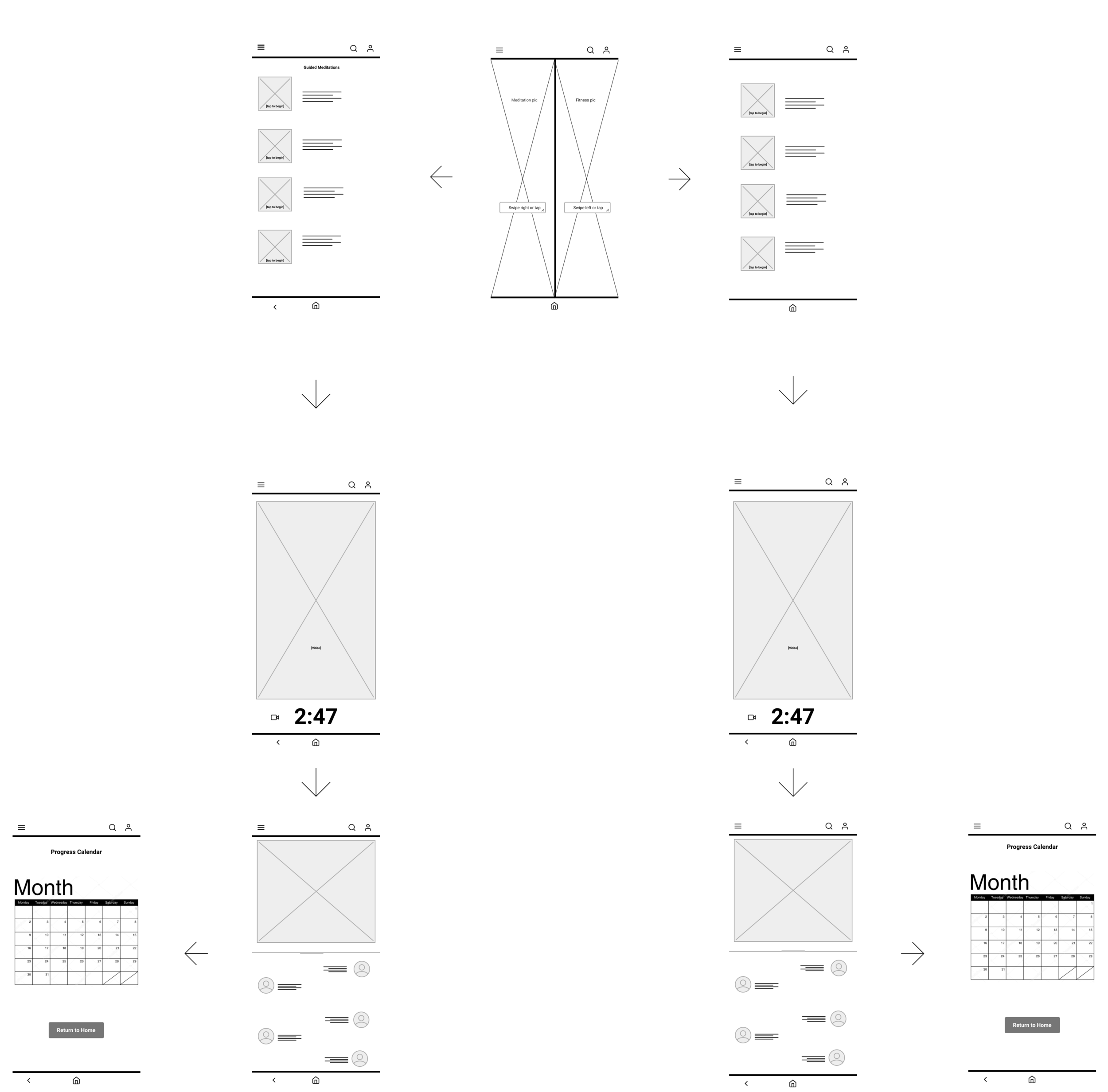
Below is the initial low-fidelity digital wireframe of the intended journey. The primary screen would be a simplistic homepage with the two options of Guided Meditation and fitness clearly labeled and as the only focal options allotted. a user would choose from one of those two options, and be met with a screen showing all the different scenarios created for guided meditation or fitness such as commutes or meditations for at home or before bed or with the family.
The video is selected and completed, and the user is given an option to engage in the messaging forum within the video. Afterwards they are given the screen to mark the calendar which will keep a running total of all the days they successfully completed a meditation or fitness program.
Through two rounds of usability studies I was able to understand how people wanted to use the app and narrow the gap between what I was providing versus what was truly wanted.
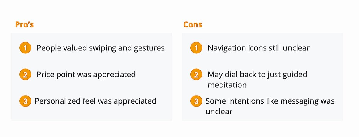
Replacing the calls to action with animated icons and small visual cues for gestures. This will encourage swiping and tapping, just as people like it.
Removing that thick navigation bar and using gestalts principle to group similar icons creates a clean form of hierarchy. At this stage color was implemented. Our light orange and mint green is echoed throughout; creating a faun presence and pronounced contrast for visual ease.